Sunday, 22 January 2012

CD Cover Research 2

This is the second of blog posts going up about CD cover research:

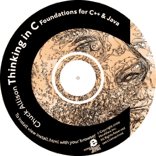
This CD cover is quite different than others. Its not what you call conventional, not really any pictures of the artist which is unusually for a CD cover. But there are still lures for the audience, the mixed colours with what can only be described as cartoons.

The design above is not as similar as "Mika's" but a large logo has been added which would draw the audiences attention. There were no small details on the front which was replicated on this design as well.  

CD Cover Research 1

The next two blog posts will be talking about CD cover research:

 This CD cover was picked not for its content but for the layout. The attention of the audience is not only drawn towards the picture but also the title/logo. The picture has gaze theory, where as the men find her attractive and the women want to be her. I'm not completely sure if I will be able to replicate that in my CD cover, however I will try by putting an attractive women along side our Bruno Mars.
The sky brings a lot of character to the CD cover, many people love the hot weather and are jealous of people who get to live in it. I want to add that theme into my cover. 

The design above has some features of Katy Perry's. As little information as possible has been added to the cover, so that the audience will concentrate more on the logo and picture. Gaze theory will be added, by having a female and male included in the cover, women want to be her and men find her attractive, bringing the widest possible audience. 

Saturday, 21 January 2012

Logo

Whilst evaluating other products we discovered that a logo is an essential to other project. To start off with we focused on creating a primarily Glee based logo. However we had to retract that idea as our music vocals are based on Bruno Mars. Our logo must show that and not confuse our audience.

We set off by creating different draft logos using Adobe Photoshop. Changing objects that we felt would fit in more with the look and audience we’re trying to attract. Below you will find some of the ideas we came up with and also some Glee ones before we had to retract that idea.   


As you see Bruno Mars own album cover is very simple, with a rocket ship flying off into the background, while creating a path. With a man walking on it, who you can only assume is Bruno Mars. This suggests that it perhaps symbolises his journey in the music career how it has taken off and been such a success. 

Below are the Bruno Mars Drafts:


Thursday, 19 January 2012

CD Research 3

This post will look at the third CD design:

Once again this design is completely different to the genre I'm using. But this layout is unique and stylish. At the top is a yellow frame, for my CD I wanted to include frames, bringing old fashion frame work together with modern photography. 

  Above you can see that the same layout has been used. I really liked the idea of using the frame for the Bruno Mars title, I feel its bringing my whole idea together. The small print is as fall out the way as possible not to bore people away. The colour again would be red and cream, I believe these two colours blend well together. The cream will make the red stand out, which would mean everything red is what I'm trying to draw the audience's attention to.

Wednesday, 18 January 2012

CD Research 2

This post will look at the second CD design:

The CD above is again not in fitting with the type of genre that is being carried out in this project. However the layout is again quite good. The CD seems to be split into two different sections, the top would be a picture of the Bruno Mars "couple" and the bottom would be the small details. Where it was published? When it was published? What record label? 

This is the design that has been replicated from the first picture. As it can be seen there are two sections. The bottom is about the details of the CD, where, how and when. The top is the main focus with a picture of the Bruno Mars "couple". I didn't want to bore people with everything mixed as one, by having it separated people didn't have to be bored with the small details and could concentrate on the main image. The colour again would be different, continuing with cream and red. Also the font would be different, by looking at our style guide which is in an early post you would see that our main font is "Nueva std" and will be used for this. 

CD Research 1

This post will be looking at different CD's that have been research and the possible design ideas that have come from it:

This CD above was chosen not because of its content but because of its layout. The outside layer, overlapping the main image behind would be perfect for the title of Bruno Mars/ Marry you. The main image behind that would have an image of the "couple".

This CD design has very similar features to the one above. The layer round the outside has been added which is then followed by a main image in the middle. The colour would obviously be different, at this present time it will be cream and red.

Tuesday, 17 January 2012

Planning Meeting

We had a planning meeting today on what we should include in our music video. Below is some ideas that came up during the meeting:

Use a variety of locations

Use transactions when changing scenes

Use a variety of shots e.g. long shots & close ups

Making sure the Lip Syncing

Day time & night time filming

Making sure we open with an establishing shot 


Research

This post and the next few will show the research that has been carried out for the Ancillary Tasks which are being constructed, such as research into:
  • CD's
  • CD Covers
  • CD Booklets
  • Posters of different music genres

Saturday, 14 January 2012

Drafts Poster

This post will analyse my poster so far:

 This is how my poster is looking so far. The colour scheme is once again consistent with the rest of the ancillary tasks. I've tried to be as conventional as possible when creating this poster, tour dates have been added to attract the audiences attention. Facebook and twitter logos have been added to relate to the younger generation. But this also indicates the growth of the social network and how its controlling our lives.  

Friday, 13 January 2012

Drafts CD Booklet

Below is the first draft of my CD Booklet:

This design is following the same style as the CD, the colours and logo are consistent throughout. This page is simple yet draws the audience in, the logo stands out well, as well as the album name below. 

This is the middle page of the CD booklet so far, keeping to the colour scheme (yellow and black). On the right hand side a 'Programme of Music' has been added, this gave the booklet a nice touch. It let the audience know who stars in the video, directed and produced it. There also a picture to show the audience who Bruno Mars is.

Above is the back page of the CD Booklet. At the bottom is the small details about the CD, where it was produced? When? And What record label? There is also a picture of the couple with a bit of drop shadow added so it would stand out to the audience. 

Thursday, 12 January 2012

Drafts

Over the past couple of weeks I have transferred the paper designs over to the computer. Below and on other posts you will find the first stage of making my ancillary tasks, which will include a:

  • CD
  • CD Booklet
  • CD Cover
  • Poster
The CD above is just a draft, far away from the finish point. But hopefully you will see where I'm going with this. Yellow and black are the main colours. The yellow makes the black stand out more which is obviously why the title is in black, the audience would be drawn towards it. Yellow was also used because its a bright, friendly colour.
On a negative note I don't think this is anyway finished, I would like to add more, e.g. something round the outside to make it more attractive and luring. 

Tuesday, 10 January 2012

First Day of Filming

28-12-2011

Today we our first day of filming, we started off by meeting rather early (8am) but unfortunately this time has to be changed due to weather conditions. It was extremely windy and rainy, which would have affected our filming. We came to the conclusion to meet at 12pm at Abbey Ruins instead of Greenwich Park. We did this because this location was easier to get to and we were still not sure about the weather conditions so we need to film as quick as possible. This site was still as picturesque as our first choice.

Below are some photos of the first day of filming:


Friday, 6 January 2012

Editing

Below is a picture of our first day of editing.
We started out by uploading our clips we had filmed over the last couple of days. Then went through and decided which ones are of a good quality and appropriate to use. The ones we didn't find useful we put to one side to use in a behind the scenes video later on in the project. We started by creating an introduction by using different locations shots we filmed on the first day. 


Wednesday, 4 January 2012

Ancillary Task

In this project along with a Music Video we have to create Ancillary Tasks. Below you will find a design idea for one of the ancillary tasks. The idea is a DVD cover, mainly focusing of Bruno Mars but also at the same time adding features from the Glee side as well.  

In this DVD cover we will incorporate a marriage invitation which not only brings consistency but also we’re following the genre of marriage. Normal codes and conventions will also be followed when creating this DVD cover, such as, the logo, title, reviews and age rating.

In a couple of weeks with hope to have more designs of different Ancillary ideas. Such as, CD covers, poster and T-shirt design.


Monday, 2 January 2012

Production Schedule

We had a group meeting to discuss realistic targets for deadlines, this will make sure we’re organised and kept focused with what we should be doing. Below you will find the targets we have set in a table. There are targets such as research, filming and ancillary tasks, after each section is complete we will update the table and post it on our blog.